认识和存储数据
三种常见的:
string:字符串
number:数字
boolean:布尔
存储变量
let price: number = 10;
存储常量
const PI:number = 3.14;
数组
语法规则:
1
2
| let 数组名:类型[] = [数据1,数据2,数据3];
let 数组名:Array<类型> = [数据1,数据2,数据3];
|
函数
语法规则:
1
2
| function 函数名(形参):返回值类型{}
函数名();
|
箭头函数
语法规则:
1
2
3
4
| let arr = (形参)=>{
}
arr();
|
对象
使用接口:
1
2
3
4
5
6
7
8
9
10
11
12
13
14
15
16
17
| interface Student {
name: string;
id: number;
sing: (song: string) => void;
dance: () => void;
}
let student: Student = {
name: "yuhong",
id: 12345,
sing: (song: string) => {
console.log("我要唱", song);
},
dance: () => {
console.log("我会跳舞");
}
}
|
使用类:
1
2
3
4
5
6
7
8
9
10
11
| class Person {
public userName: string;
public password: number;
constructor(userName: string, password: number) {
this.userName = userName;
this.password = password;
}
}
let person1: Person = new Person('yuhong', 12345);
|
联合类型
联合类型是一种灵活的数据类型,它修饰的变量可以存储不同的数据类型。
语法规则:
1
2
3
4
| let 变量: 类型1 | 类型2 | 类型3 = 值;
let judge: string | number = 100;
judge = "200";
|
甚至还可以将变量值约定在一定的范围内进行选择:
1
| let gender: "man" | "woman" | "secret" = "man";
|
枚举类型
枚举类型是一种特殊的数据类型,约定变量只能在一组数据范围内进行选择。
1
2
3
4
5
6
7
8
9
10
11
12
| enum 枚举名{
常量1 = 值;
常量2 = 值;
常量3 = 值;
}
enum Type{
Click = true;
Slide = true;
}
let aka: Type = Type.Click;
|
界面开发
1
2
3
4
5
6
7
8
9
10
11
12
13
14
15
16
17
18
19
20
21
22
23
24
25
| @Entry
@Component
struct Index {
@State message: string = 'Hello World1';
//界面中展示的内容都在bulid中进行编写
build() {
RelativeContainer() {
//下方的链式调用即是对文本进行各个参数进行修改
Text(this.message)
.id('HelloWorld')
.fontSize($r('app.float.page_text_font_size'))
.fontWeight(FontWeight.Bold)
.fontColor(Color.Red)
.alignRules({
center: { anchor: '__container__', align: VerticalAlign.Center },
middle: { anchor: '__container__', align: HorizontalAlign.Center }
})
.onClick(() => {
this.message = 'Welcome';
})
}
.height('100%')
.width('100%')
}
}
|
界面开发-组件
ArkUI(方舟开发框架)是一套构建鸿蒙应用界面的框架。
构建页面的最小单位是“组件”。
组件分类:
- 基础组件:呈现界面的基础元素,如文字、图片、按钮等。
- 容器组件:控制布局组件,如Row行、Column列等。
组件属性方法
1
2
3
4
5
6
7
8
9
10
11
12
13
14
15
16
17
18
19
20
21
22
23
24
25
26
27
28
29
30
31
32
33
34
35
36
37
38
39
40
41
42
43
44
45
46
47
48
49
50
51
52
53
54
55
56
57
| @Entry
@Component
struct Index {
@State message: string = 'Hello World1';
build() {
RelativeContainer() {
Column() {
// 如果不设宽度的话就会默认居中显示
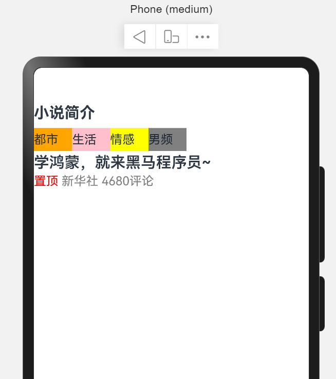
Text("小说简介")
.width("100%")
.height(40)
.fontSize(20)
.fontWeight(FontWeight.Bold)
Row() {
Text("都市")
.backgroundColor(Color.Orange)
.height(30)
.width(50)
Text("生活")
.backgroundColor(Color.Pink)
.height(30)
.width(50)
Text("情感")
.backgroundColor(Color.Yellow)
.height(30)
.width(50)
Text("男频")
.backgroundColor(Color.Gray)
.height(30)
.width(50)
}
.width("100%")
Text("学鸿蒙,就来黑马程序员~")
.width("100%")
.fontSize(20)
.fontWeight(600)
.height(30)
Row() {
Text("置顶 ")
.fontColor(Color.Red)
Text("新华社 ")
.fontColor(Color.Gray)
Text("4680评论")
.fontColor(Color.Gray)
}
.width("100%")
}
}
.height('100%')
.width('100%')
}
}
|
示意图:
文字溢出省略号、行高
- 文字溢出省略(设置文本超长时的显示方式)
语法:1
2
3
| .textOverflow({
overflow: TextOverflow.XXX
})
|
- 行高
语法:.lineHeight(数字)
1
2
3
4
5
6
7
8
9
10
11
12
13
14
15
16
17
18
19
20
21
22
23
24
25
26
27
28
29
| @Entry
@Component
struct Index {
@State message: string = 'Hello World1';
build() {
RelativeContainer() {
Column() {
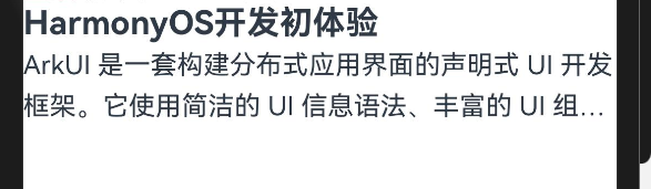
Text("HarmonyOS开发初体验")
.width("100%")
.fontSize(20)
.fontWeight(FontWeight.Bold)
Text("ArkUI 是一套构建分布式应用界面的声明式 UI 开发框架。它使用简洁的 UI 信息语法、丰富的 UI 组件、以及实时界面预览工具,帮助你提升 HarmonyOS 应用界面开发效率。你只需使用一套 ArkTS API,就能在多个 HarmonyOS 设备上提供生动而流畅的用户界面体验。")
.width("100%")
//用于约束溢出限制的行数时变为省略号
.textOverflow({
overflow: TextOverflow.Ellipsis
})
//超出两行即为溢出
.maxLines(2)
//设置文本的行高
.lineHeight(25)
}
}
.height('100%')
.width('100%')
}
}
|
示意图:
Image图片组件
Image图片组件,用于展示页面中的图片。
语法:Image(图片数据源)
数据源支持网络图片资源和本地图片资源。
其中本地图片资源必须存放在项目文件夹中的resource->base->media文件夹当中。
并且路径可以简写为:
1
| Image($r("app.media.文件名"))
|
对Image组件进行宽或高进行设定,另一边会对应进行缩放。
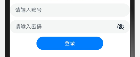
输入框和按钮
输入框:TextInput()
配置参数placeholder即可实现占位符。
.type属性方法控制输入框是否为密文(Password)。
在column的括号中添加属性space即可以控制纵向上元素的间隔。
1
2
3
4
5
6
7
8
9
10
11
12
13
14
15
16
17
18
19
20
21
22
23
24
25
26
| @Entry
@Component
struct Index {
@State message: string = 'Hello World1';
build() {
RelativeContainer() {
Column({ space: 10 }) {
TextInput({
placeholder: "请输入账号"
})
TextInput({
placeholder: "请输入密码"
})
.type(InputType.Password)
Button("登录")
.width(200)
}
}
.height('100%')
.width('100%')
}
}
|
示意图:
设计资源-svg图标
svg图标的优点是,任意缩小放大不失真,可以修改颜色。
使用属性方法.fillColor,可以修改图标的颜色。
1
2
3
| Image($r("app.media.ic_gallery_not_this_person"))
.width(50)
.fillColor(Color.Red)
|
布局元素的组成
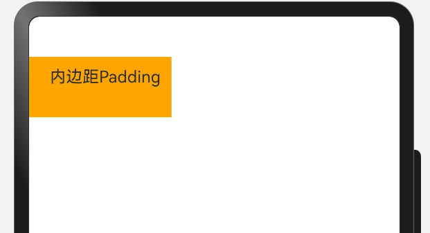
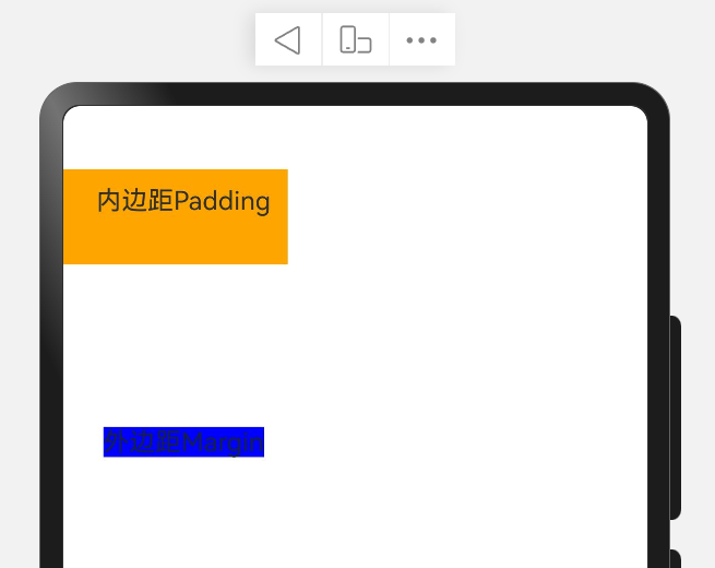
内边距padding
内边距:内部元素与边框的距离。
1
2
3
4
5
6
7
8
9
| Text("内边距Padding")
// .padding(20) 在四个方向上都是20的内边距
.padding({
top: 10,
bottom: 30,
left: 20,
right: 10
})
.backgroundColor(Color.Orange)
|
示意图:
外边距margin
外边距:边框与其他相邻元素之间的距离。
1
2
3
4
5
6
7
8
9
| Text("外边距Margin")
// .margin(20) 在四个方向上都是20的外边距
.margin({
top: 100,
bottom: 30,
left: 20,
right: 10
})
.backgroundColor(Color.Blue)
|
示意图:
边框border
给组件添加边框,进行美化。
有三种样式:
- BorderStyle.Solid:实线
- BorderStyle.Dashed:虚线
- BorderStyle.Dotted:点线
语法:其中宽度、颜色、边框样式四个方向都可以分别设置。
1
2
3
4
5
6
| Text("待完善")
.border({
width: 2,
color: Color.Blue,
style: BorderStyle.Solid
})
|
圆角组件
.borderRadius(参数)
可以只传一个数字对四个角同时进行设置,也可以分别对四个角进行设置。
- topLeft:左上角
- topRight:右上角
- bottomLeft:左下角
- bottomRight:右下角
1
2
3
4
5
6
7
8
9
| Image($r("app.media.psc"))
.width(200)
.borderRadius(10)
.borderRadius({
topLeft:10
topRight:20
bottomLeft:0
bottomRight:30
})
|
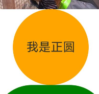
特殊的圆角组件
正圆
要求高度和宽度保持一致,borderRadius取一半的值。
1
2
3
4
5
6
| Text("我是正圆")
.backgroundColor(Color.Orange)
.width(100)
.height(100)
.textAlign(TextAlign.Center)
.borderRadius(50)
|
示意图:
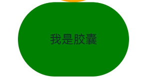
胶囊按钮(左右半圆)
要求宽度长于高度,圆角是高度的一半。
1
2
3
4
5
6
| Text("我是胶囊")
.backgroundColor(Color.Green)
.width(150)
.height(100)
.textAlign(TextAlign.Center)
.borderRadius(50)
|
示意图:
背景属性
ImageRepeat属性用于控制背景图是否进行平铺,
参数有NoRepeat(默认,不平铺),X:水平平铺,Y:垂直平铺,XY:水平垂直方向均平铺。
1
2
3
4
| Text("背景")
.backgroundColor(Color.内置的颜色枚举)
.backgroundColor("十六位色值")
.backgroundImage(图片源,ImageRepeat)
|
背景图位置 - backgroundImagePosition
作用:调整背景图在组件内的显示位置,默认显示位置为组件左上角。
属性:.backgroundImagePosition(坐标对象或枚举)
参数:
- 位置坐标:{x:位置坐标,y:位置坐标}
- 枚举 Alignment(组件的左上角、中间、右下角等位置)
1
2
3
4
5
6
7
| Text("背景图位置")
.backgroundColor(Color.Pink)
.width(100)
.height(80)
.backgroundImage($r("app.media.startIcon"))
.backgroundImagePosition({ x: 20, y: 20 })
.backgroundImagePosition(Alignment.Center)
|
背景图尺寸 - backgroundImageSize
作用:背景图缩放
属性:.backgroundImageSize(宽高对象或枚举)
参数:
- 背景图宽高:{width:尺寸,height:尺寸}
- 枚举 ImageSize:
- Container:等比例缩放背景图,当宽或高与组件尺寸相同停止缩放。
- Cover:等比例缩放背景图至图片完全覆盖组件范围。
- Auto:默认、原图尺寸
线性布局
线性布局(LinearLayout)通过线性容器Column和Row创建。
- Column容器:子元素垂直方向排列。
- Row容器:子元素水平方向排列。
排布主方向上的对齐方式:
.justifyContent(枚举FlexAlign)
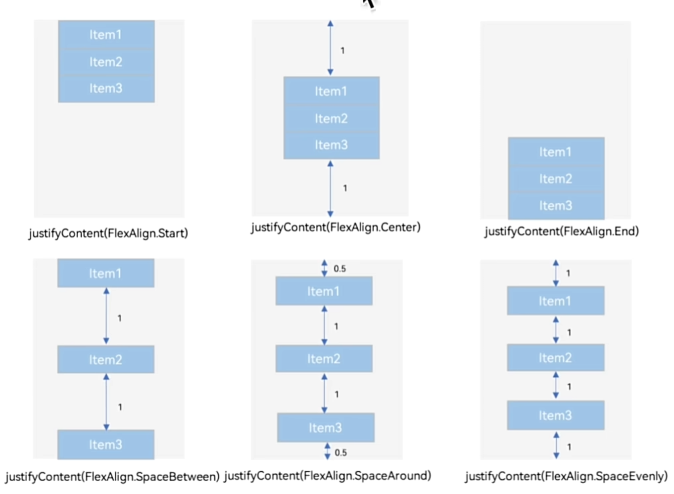
交叉轴(Column和Row的垂直方向)的对齐方式
属性:alignItems()
参数:枚举类型
- 交叉轴在水平方向:HorizontalAlign
- 交叉轴在垂直方向:VerticalAlign
1
2
3
4
5
6
7
8
9
10
11
12
13
14
15
16
17
18
| Column() {
Text()
.width(300)
.height(100)
.backgroundColor(Color.Pink)
Text()
.width(300)
.height(100)
.backgroundColor(Color.Pink)
Text()
.width(300)
.height(100)
.backgroundColor(Color.Pink)
}
.width("100%")
.height("100%")
.justifyContent(FlexAlign.SpaceEvenly)
.alignItems(HorizontalAlign.End)
|
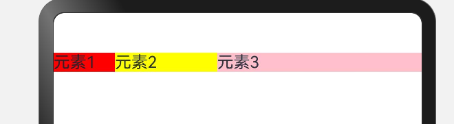
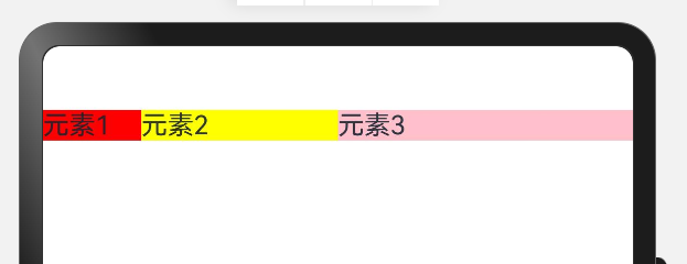
自适应伸缩
设置layoutWeight属性的子元素和兄弟元素,会按照权重进行分配主轴的空间。
语法:.layoutWeight(数字)
其他元素如果设置了定宽,则layoutWeight(1)的意思就是在除去定宽剩余的宽度下占据1份,如果总共只有一份,则全部占满。
如果都是通过份数去分配的,则按份数进行占比。
示意如下:
1
2
3
4
5
6
7
8
9
10
11
| Row() {
Text("元素1")
.backgroundColor(Color.Red)
.layoutWeight(1)
Text("元素2")
.backgroundColor(Color.Yellow)
.width(100)
Text("元素3")
.backgroundColor(Color.Pink)
.width(200)
}
|
1
2
3
4
5
6
7
8
9
10
11
| Row() {
Text("元素1")
.backgroundColor(Color.Red)
.layoutWeight(1)
Text("元素2")
.backgroundColor(Color.Yellow)
.layoutWeight(2)
Text("元素3")
.backgroundColor(Color.Pink)
.layoutWeight(3)
}
|
Flex弹性布局
弹性容器组件:Flex()
默认主轴方向水平向右,交叉轴方向垂直向下。
且Flex子组件的宽高之和大于Flex盒子,则会压缩子元素的宽高,不会溢出显示。
1
2
3
4
5
6
| Flex(参数对象){
子组件1
子组件2
子组件3
子组件4
}
|
- 主轴方向:direction
- 主轴对齐方式:justifyContent
- 交叉轴对齐方式:alignItems
- 布局换行:wrap
1
2
3
4
5
6
| Flex({
direction: FlexDirection.Column,
justifyContent: FlexAlign.SpaceBetween,
alignItems: ItemAlign.Center,
wrap: FlexWrap.Wrap
})
|
绝对定位 - position
作用:控制组件位置,可以实现层叠效果。
特点:
- 参照
父组件左上角进行偏移。
- 绝对定位后的组件
不再占有自身原有的位置。
语法:.position(位置对象)
参数:{x:水平偏移量,y:垂直偏移量}
层级 - zIndex
作用:调整组件的层级。
语法:.zIndex(层级数)
默认组件的层级都为0,数越大,层级越靠上。
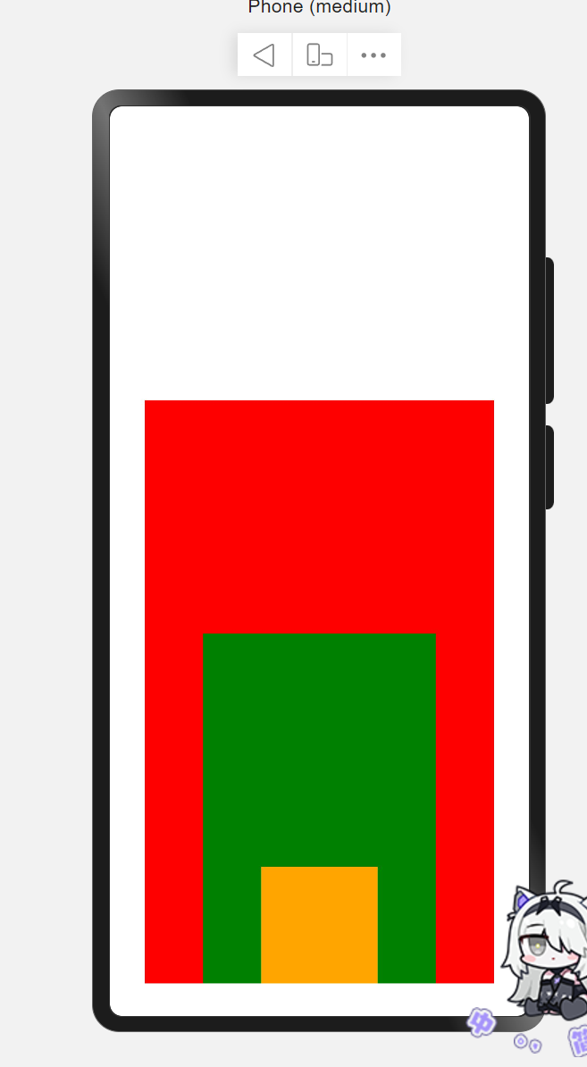
层叠布局
层叠布局具有较强的组件层叠能力。场景:卡片层叠效果等。
特点:层叠操作更简洁,编码效率高。(绝对定位的优势是更灵活)
语法:stack(){}
alignContent用于对内部子元素的定位。
1
2
3
4
5
6
7
8
9
10
11
12
13
14
15
16
17
18
19
20
21
22
| build() {
RelativeContainer() {
Stack({
alignContent: Alignment.Bottom
}) {
Text()
.width(300)
.height(500)
.backgroundColor(Color.Red)
Text()
.width(200)
.height(300)
.backgroundColor(Color.Green)
Text()
.width(100)
.height(100)
.backgroundColor(Color.Orange)
}
.width("100%")
.height("100%")
}
}
|
示意图:
程序开发部分
模板字符串
作用:拼接字符串和变量
1
2
3
| let name: string = `小明`;
let age: number = 18;
console.log("简介信息", `姓名是${name},今年${age}岁了。`);
|
类型转换
- 字符串转数字
- Number():字符串直接转数字,转换失败返回NaN(字符串中包含非数字)
- parseInt():去掉小数部分转数字,转换失败返回NaN
- parseFloat():保留小数部分转数字,转换失败返回NaN
- 数字转字符串
- toString():数字直接转字符串
- toFixed():四舍五入转字符串,可设置保留几位小数
交互-点击事件
说明:组件被点击时触发的事件
作用:监听用户的点击行为,进行对应的操作
语法:onClick((参数)=>{})
1
2
3
4
5
6
| Button('点我,显示弹框')
.onClick(()=>{
AlertDialog.show({
message: "你好,这是一个弹框"
})
})
|
状态管理
之前构建的页面多为静态页面
但如果希望构建一个动态的、有交互的界面,就需要引入“状态”的概念
普通变量:只能在初始化时渲染,后续将不会再进行刷新。
状态变量:需要装饰器装饰,改变会引起UI的渲染刷新(必须设置类型和初始值)。